The short answer
Use a dark code on a light background, and keep the contrast at 4 to 1 or better. Every pair that met both conditions was read by every decoder we tried. Pairs that did not meet them were read by some scanners and not others, and one pair was read by none.
Almost any hue works as the code colour. Blue, red, green, purple, teal and pink all scanned. What matters is how much darker the code is than its background, not which colour it is.
If you would rather skip the reading, our custom QR code generator decodes your styled code on every change and warns you when contrast drops below 4 to 1.
How we tested
We generated one QR code, a 29 by 29 grid holding a web address, at error correction level M. We then drew it 20 times in different foreground and background colours at the same size, and tried to decode each image three ways:
- OpenCV, a widely used computer vision library with its own QR detector.
- jsQR in its default mode, the open source decoder our tools use.
- jsQR told to try the colours inverted as well, which is how a scanner that supports light on dark codes would behave.
For each pair we also worked out the contrast ratio using the standard web accessibility formula, where 1 to 1 means identical brightness and 21 to 1 is black on white.
Software decoders, not phones. Phone cameras use their own scanning code, and they will not all agree with ours. This test is a clean digital render with no print, no glare and no camera blur. Treat it as a map of where the risk is, then check your own code on real phones.
The results, all 20
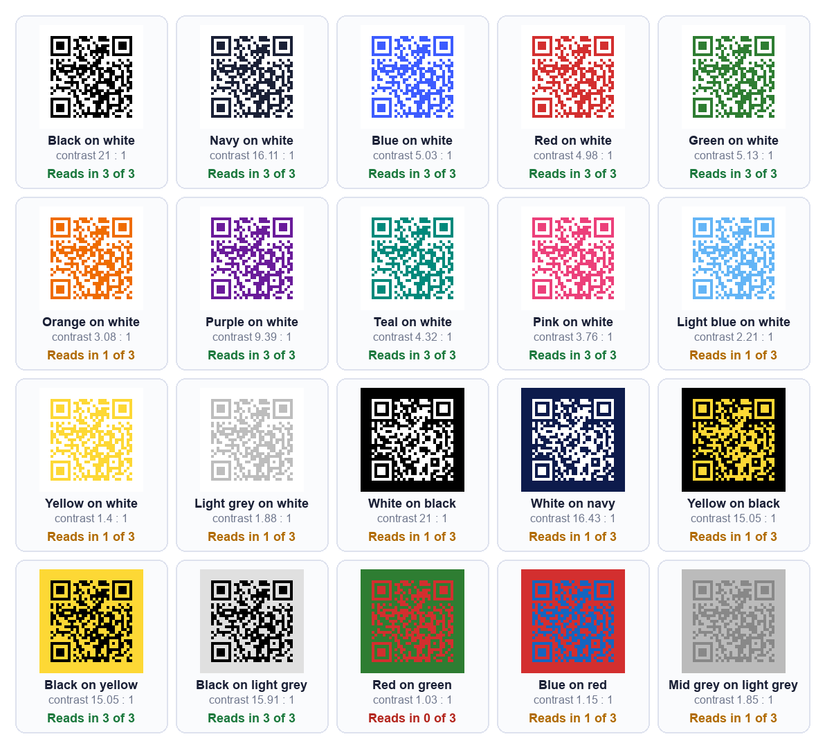
| Colour pair | Contrast | OpenCV | jsQR default | jsQR, inverted too |
|---|---|---|---|---|
| Black on white | 21 : 1 | Reads | Reads | Reads |
| Navy on white | 16.11 : 1 | Reads | Reads | Reads |
| Blue on white | 5.03 : 1 | Reads | Reads | Reads |
| Red on white | 4.98 : 1 | Reads | Reads | Reads |
| Green on white | 5.13 : 1 | Reads | Reads | Reads |
| Orange on white | 3.08 : 1 | Reads | Fails | Fails |
| Purple on white | 9.39 : 1 | Reads | Reads | Reads |
| Teal on white | 4.32 : 1 | Reads | Reads | Reads |
| Pink on white | 3.76 : 1 | Reads | Reads | Reads |
| Light blue on white | 2.21 : 1 | Reads | Fails | Fails |
| Yellow on white | 1.4 : 1 | Reads | Fails | Fails |
| Light grey on white | 1.88 : 1 | Reads | Fails | Fails |
| White on black | 21 : 1 | Fails | Fails | Reads |
| White on navy | 16.43 : 1 | Fails | Fails | Reads |
| Yellow on black | 15.05 : 1 | Fails | Fails | Reads |
| Black on yellow | 15.05 : 1 | Reads | Reads | Reads |
| Black on light grey | 15.91 : 1 | Reads | Reads | Reads |
| Red on green | 1.03 : 1 | Fails | Fails | Fails |
| Blue on red | 1.15 : 1 | Reads | Fails | Fails |
| Mid grey on light grey | 1.85 : 1 | Reads | Fails | Fails |
Where the contrast line sits
Look only at the dark-on-light pairs. Pink on white, at 3.76 to 1, was read by every decoder, and so was everything with more contrast than that: teal, red, blue, green, purple, navy and black.
Orange on white, at 3.08 to 1, was not. OpenCV read it and both jsQR settings failed. So for this code, the line sits somewhere between 3.08 and 3.76.
That is one code, and the exact line will move a little with the code's size and density. It is why our designer warns below 4 to 1 rather than at the lowest figure that happened to work. A margin is worth having, because printing can take some contrast away.
In the designer we saw the same story. Blue on white scanned cleanly. Orange on white scanned with a warning that contrast was only 3.1 to 1. Yellow on white and light grey on white were flagged as not scanning, with contrasts of 1.4 and 1.9 to 1.
Scanners disagree near the edge
The most useful thing in the table is how differently the decoders behaved on the weak pairs.
OpenCV read yellow on white at 1.4 to 1, and mid grey on light grey at 1.85 to 1. Both jsQR settings failed them. Blue on red, at 1.15 to 1, split the same way.
If you test a pale colour on one phone and it works, that tells you about that phone. It does not tell you about the one belonging to the person scanning your poster. Nine of our 20 pairs sat in exactly this uncertain middle.
One pair sat outside it. Red on green, at 1.03 to 1, was read by nobody. To the eye red and green look very different, but they are nearly the same brightness, and a scanner works from brightness.
Light on dark is a different problem
Three pairs had a lot of contrast and still failed: white on black, white on navy and yellow on black. Their contrast ratios are 21, 16.43 and 15.05 to 1.
The reason is not contrast. A standard QR code is dark modules on a light background, and these three are the other way round. OpenCV and default jsQR both failed all three. They only read when we explicitly told jsQR to try inverted images as well.
Compare yellow on black with black on yellow. The same two colours at the same 15.05 to 1 ratio, swapped. One read in all three settings and the other in just one. Which colour is darker matters more than which colours you chose.
Some scanners do handle inverted codes and some do not, and a printed code cannot tell you which kind it will meet. If you want a dark design, keep the code dark and make the background light, or put a light panel behind the code on the dark design.
What to do with your brand colour
- Make the code the dark colour and the background the light one. If your brand colour is pale, use it for the background or frame, and draw the code in a darker shade of it.
- Measure the contrast. Aim for 4 to 1 or more. For a code that will be scanned from a distance or printed on rough stock, aim well above that.
- Test with more than one scanner. Use a plain QR scanner such as ours, and at least one phone camera.
- Keep a plain version in reserve. A black on white file costs nothing and is the one that always works.
On gradients: a gradient code changes colour across its width, so its contrast is set by its lightest end rather than its average. We did not test gradients in this round, so that is reasoning, not a measurement. Check the pale end against the background.
What this test cannot tell you
We would rather be clear than impressive about this.
- No phones. We used software decoders. A phone camera may do better or worse on any pair.
- No print. Ink spreads, paper reflects glare and colours shift between a screen and a printer. A pair that is borderline on screen is more borderline on paper.
- One code. Results were for one 29 by 29 code. A larger, denser code is harder to read at the same contrast.
- Clean images. We added no blur or tilt. Our earlier test of why QR codes fail to scan shows how quickly those eat into a margin.
Common questions
Can a QR code be any colour?
Almost any hue works for the code, provided it is dark enough against its background. Blue, red, green, purple, teal and pink all scanned in our test. What fails is low contrast and light on dark.
Does the background colour matter?
Yes, as much as the code colour, because contrast is the gap between the two. A pale background with a dark code is the safest arrangement.
Can I use a white QR code on a black background?
Some scanners read it and some do not. In our test, white on black failed in OpenCV and in default jsQR, and read only when we asked jsQR to try inverted images. If it matters that everyone can scan it, use dark on light.
Is yellow a bad colour for a QR code?
Yellow as the code colour on white was poor: 1.4 to 1, and it read in only one of three settings. Yellow as the background with a black code was fine and read in all three.
What contrast ratio should I aim for?
4 to 1 or more as a minimum. In our test everything above 3.76 to 1 on a light background read everywhere, and the pair at 3.08 did not. More is better for print.
Can I use a transparent background?
A transparent background takes on whatever sits behind the code, so the contrast is decided by that, not by your colour choice. Use it only over a plain, light surface, and test the final result.
How can I check my own colours?
Our custom QR code generator decodes the code you are looking at after every change and reports whether it still reads, and what the contrast is. Our scanner reads a saved image back as text, which is a second opinion.